Creating a New Analysis Report
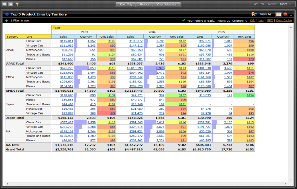
Note: The field view in the sample report below is organized by Category (hierarchies and levels within a dimension). You can organize the field view in your Analysis report alphabetically (A-Z), by Number (measures) - Text (names, categories, etc.) - Time (months, quarters, and years), and by Schema, which displays the dimensions as defined in the Mondrian schema.
Follow the instructions below to start creating the Analysis report.
1. In the Business Intelligence User Console menu, go to File -> New and select Analysis Report. Alternatively, on the Home page, click Create New and select Analysis Report. A Select Data Source dialog will appear.
2. Select your Data Source from the list. In this example we selected Visits.
Note: The list of available Data Sources is provided by your administrator.
3. In the Available Fields panel on the left, click and drag Branch to the Rows panel within the Layout panel. The Branch column appears in the workspace.
4. In the list of fields, click and drag Served to the Measures area within the Layout panel. The Served column appears in the workspace.
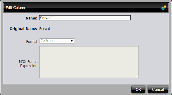
5. Right-click the Served column to display the Edit Column dialog box. Select Column Name and Format. The Edit Column dialogue box appears.
6. From the Format drop-down box, select Default so that your values display as a number. Click OK.
7. In the list of fields, click and drag No Shows to the Measures panel within the Layout panel.
The No Shows column appears in the workspace.
8. Click and drag the Day of Week column to the Columns panel within the Layout panel.
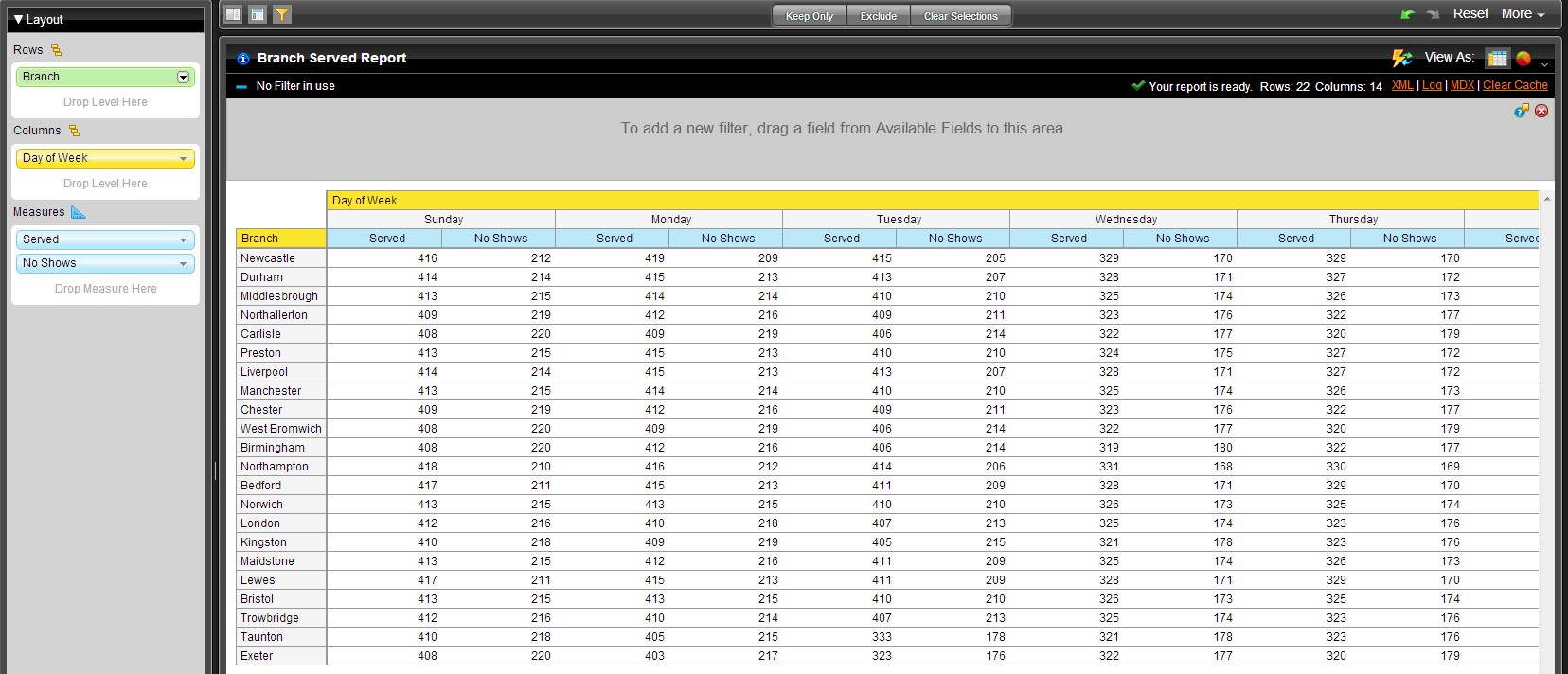
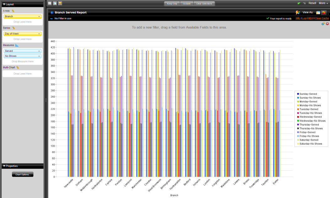
At this point you have a functioning report and you can view your data in chart form. Click
Switch to Chart Format,

, in the upper right corner, to examine your report data in a chart format. The default display is a bar chart but if you click
Choose Chart Type,
, you can select a different chart type to display your data. Here are a couple of examples of what it may look like:
9. Save your report before going on. In the Business Intelligence User Console, click Save As. When the Save As dialog box appears, save your report with a suitable name and click OK.



 At this point you have a functioning report and you can view your data in chart form. Click Switch to Chart Format,
  , in the upper right corner, to examine your report data in a chart format. The default display is a bar chart but if you click Choose Chart Type,
 , you can select a different chart type to display your data. Here are a couple of examples of what it may look like: