Geography Map Visualizations in Analysis
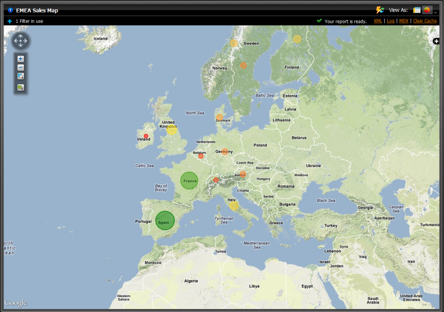
Geo maps allow users the ability to visualize data on a geographic map. This visualization type will plot a pin on a map based on the location attribute used. You can then use a measure to color-code the pen and/or use a measure to specify the size of the pin. If your model has geographic annotations then the location information will be retrieved by the geoService automatically.
Customizing Geography Map Visualizations in Analysis
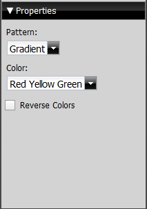
The Properties panel enables you to customize the appearance of map visualizations.
The Pattern drop-down box allows you to decide the way the colors of the pins populate. The appearance does not denote any of the data, it is solely for aesthetics. You have the option of selecting:
• Gradient
• 3 Step
• 5 Step
The Color drop-down box allows you to decide which colors denote large measures and which colors denote smaller measures. The color denotes the size of the data, from small to large. You have the option of selecting:
• Red Yellow Green
• Red Yellow Blue
• Blue Scale
• Gray Scale
You also have the option of checking the Reverse Colors box, which will allow you to choose the inverse colors so they appear large, to small.


