Working with the Chart Designer
The Chart Designer allows you to create bar, pie, line, dial, and area charts that can be added to a dashboard. Below are the general steps associated with creating a chart:
1. Select a data source.
2. Build a query.
3. Set the data definitions: values, series, and category.
4. Select a chart type and theme.
5. Enter labels for the chart title, and x,y axes.
6. If applicable, adjust scaling and label rotation.
7. Place your chart in the dashboard.
8. Save your dashboard.
If you are new to charting, here are some minimal guidelines that may help you determine what type of chart is best suited for the data you want to present in your dashboard:
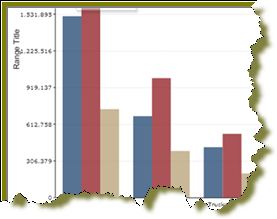
Bar Charts
If you want to compare items during a specific time period, consider using a bar chart. Key words to think about when creating a bar chart are compare or rank. For example if you want to compare items sold to show which one made the most profit, you might create a bar chart that ranks the products from the lowest to highest profit. The bar's length determines its ranking; the label identifies the item. Bar chart data can be presented horizontally or vertically depending on your requirements.
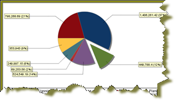
Pie Charts
If you are comparing parts of a whole, consider using a pie chart. Key words associated with charts include, portion, share, and percentage. If for example, you want to demonstrate the proportion of the company's budget spent on health insurance, use a pie chart. To make the chart easier to read limit the number of slices to five. Pie charts can also be exploded, which means certain slices are pulled away from the remainder of the chart for emphasis.
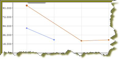
Line Charts
Line charts are useful for showing changes over time. Key words associated with data that is best suited for a line chart are trend, growth, and decline. If, for example, you want to show how product sales have changed over five years, use a line chart. The slope of the line helps users quickly identify the direction of the trend.
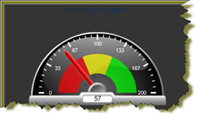
Dial Charts
Dial charts are often associated with Key Performance Indicators (KPIs). Dial charts are circular and contain a scale, a needle, and one or more a dial sectors. The dial sector is used to identify a specified area on a dial chart using a particular color. For example, you could have a dial plotting inventory with a minimum dial value of 10000 and a maximum dial value of 50000. There could be a red dial sector for the region between 2000 and 4000 indicating that if the needle is in this area, there is a danger of a supply inventory shortage.
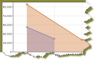
Area Charts
Area charts can be used to show a comparison of the same thing during different points in time. Area charts are not designed to provide exact data but they do give users visual clues of the relative sizes of the items they are representing.
